


Currently, blogging is becoming more and more popular and so are various blogging platforms. Many people are starting their own blogs, just like yours truly did ;) Although most of my audience is from Hashnode community. But, hey reader, if you are not part of Hashnode and are still confused about which blogging platform to use, then you can go with Hashnode . Trust me, you won't be disappointed. That is because Hashnode is a free and user friendly blogging platform. In a few seconds, you can set up your own blog!
I have observed that many do not make the most of their blog. But then again, many want to but simply don't know how to, just like I didn't! When I first joined Hashnode, the custom CSS feature was very appealing to me as I wanted to design my own blog. So, I searched a lot on how to do so but didn't find much. Therefore, here I am writing an article on how I styled my Hashnode blog hoping that you guys won't be as confused as I was.
Before we move on, l want to make sure that you all know that Custom CSS can not be accessed by everyone. Only by becoming an ambassador can you access this feature. But don't worry, becoming an ambassador is very easy. Just follow the steps given here:
Congrats, you're an ambassador now and have unlocked a lot of cool features! So, let's take a look at how I styled my Hashnode blog ;)
Enabling Custom CSS
To enable the Custom CSS, follow these steps:
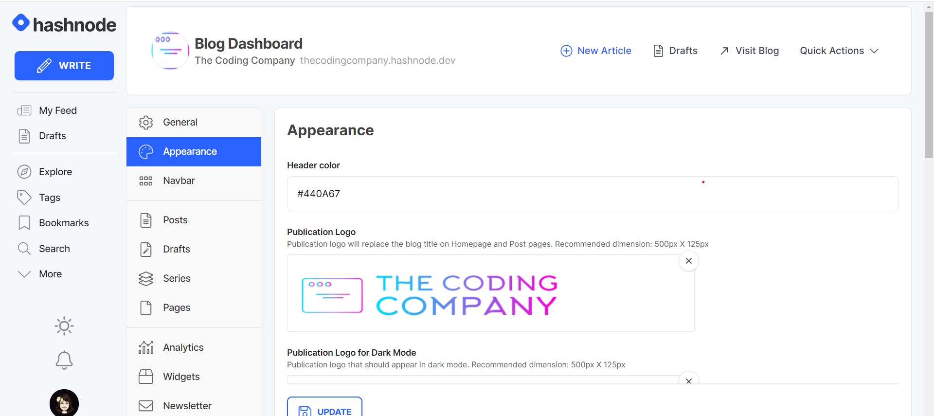
1) Go to Blog Dashboard.
2) Select Appearance as shown below.
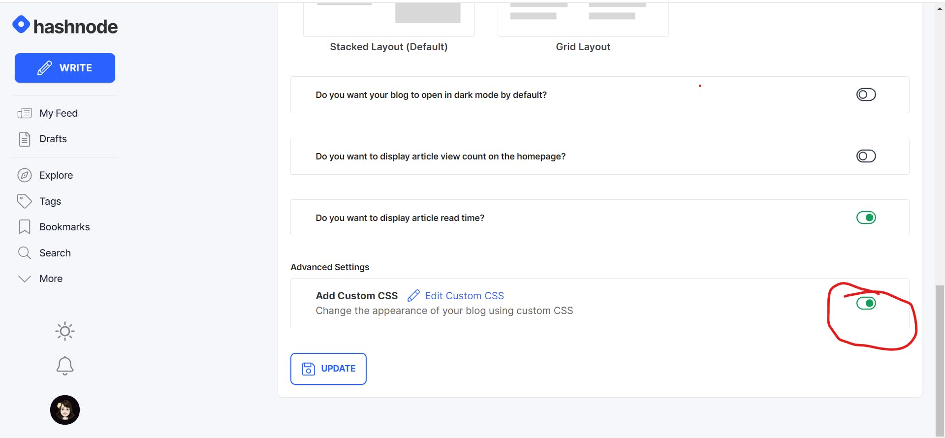
3) Scroll down till the end of the page to Custom CSS under Advanced Settings and enable it as I have done so!
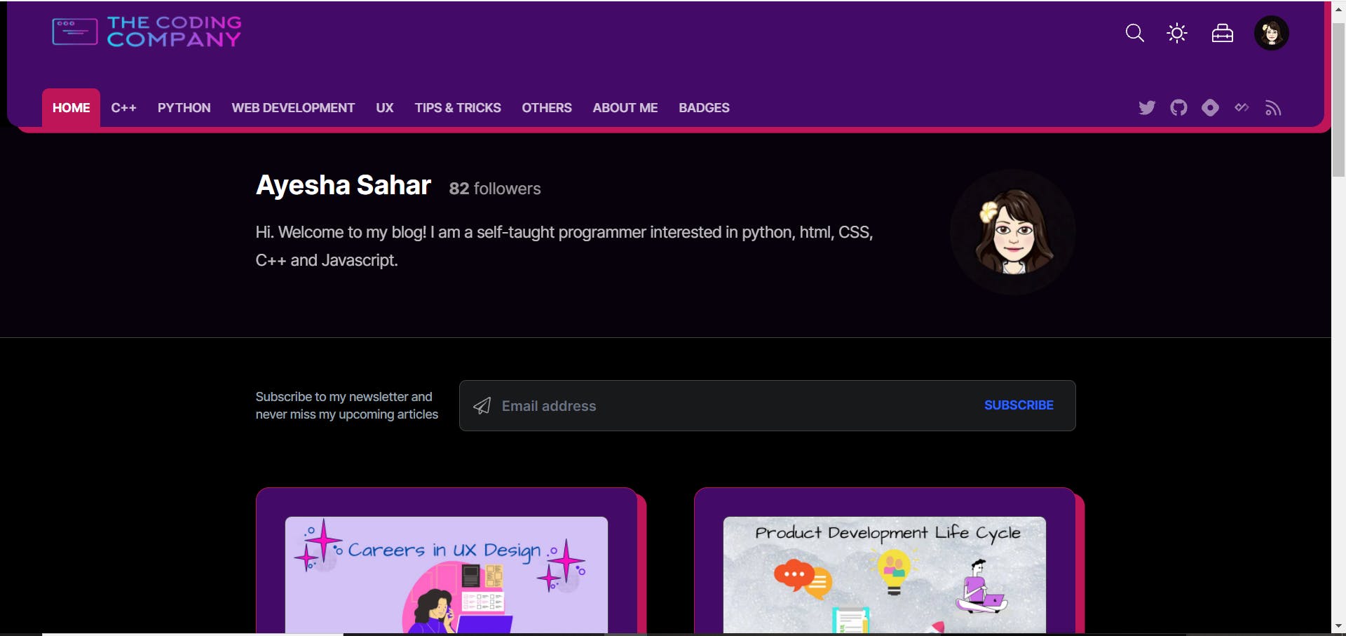
Styling the Header
I have visited a lot of blogs and most people only changed the color of their header. No offense intended, but that does look a bit plain😅 Everyone wants their blog to be unique and so do I.
This is how my blog header looked before:
Pretty boring, right? But it didn't last for long.
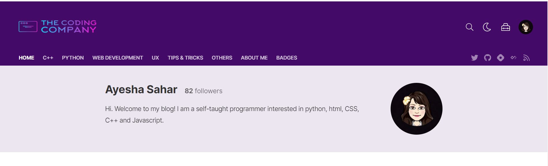
This is how my blog header looks now!
And this is what I did to achieve it:
.blog-header{
    margin: 0 0.5rem 0 0.5rem;
    border-radius: 15px;
    box-shadow: 10px 7px 0 #be1558;
}

.blog-nav-active{
    background: #be1558;
    color: #fff;
}

.blog-nav-active:hover{
    color:  #FDBAF8;
}
I used box-shadow to add the pretty pink cover around the header. By border-radius, I added that round curve at the ends of the header.
Content area
I feel that visuals are enough to explain how plain my blog home was, so here you go:
My inner artist just couldn't allow this offense to continue, so I did some changes, and Thank God I did!

I changed the colors of the postcards and tweaked their designs a bit. Also, I changed the background color to purple as it is one of my favourite colors, as you can already see😂
.blog-content-area{
    margin-top: 3rem;
    margin-bottom: 3rem;
}


.blog-post-card-wrapper{
    padding: 2rem;
    border: 1px solid #be1558;
    border-radius: 15px;
    box-shadow: 10px 7px 0 #be1558;
    background:  #f4e3fa  ;
}

.dark .blog-post-card-wrapper{
    background:  #440A67;
}

.blog-body {
  background: #eaeafb !important;
}

.dark .blog-body {
  background: #000000 !important;
}
You may see that I have used !important too. That is because without !important the background color was not changing at all. The !important rule is used to add more importance to a value than normal. By using !important rule, you can override ALL previous styling rules for that specific property on that element! Though I have used it a lot before, like you all, I am also a mere mortal that definitely remembers the whole book before the exam but forgets everything during the exam. So, the smart me actually forgot about it and had to spend hours thinking about what I was doing wrong. Here, I'd like to thank Avneesh Agarwal bro again for taking me out of my misery😂
Enough small talk, let's move back to the main topic! So, another peculiar thing you may have noticed could be ".dark". I feel that I cannot explain this "nicely enough" in words so let's see .dark in action:
Footer
I'll admit it, I didn't really do enough with my footer except changing a few colors but it definitely looks a lot better than before!
Though some words can't be clearly seen, I definitely like purple as the color of my footer better. I tried to change the font color of Hashnode to baby pink like I did with Privacy and terms, but couldn't do so >﹏<
This is how I did so:
.blog-footer-area{
    background:#440A67 !important;
    color:  #ffe6f2 !important ;
}
I think that we've styled our homepage enough, let's move on to the articles page!
Since you're here, reading this article, take a look around, what do you see different? I bet it's the background color, the area around comments, and the series articles list right?
Let's see how I achieved this!
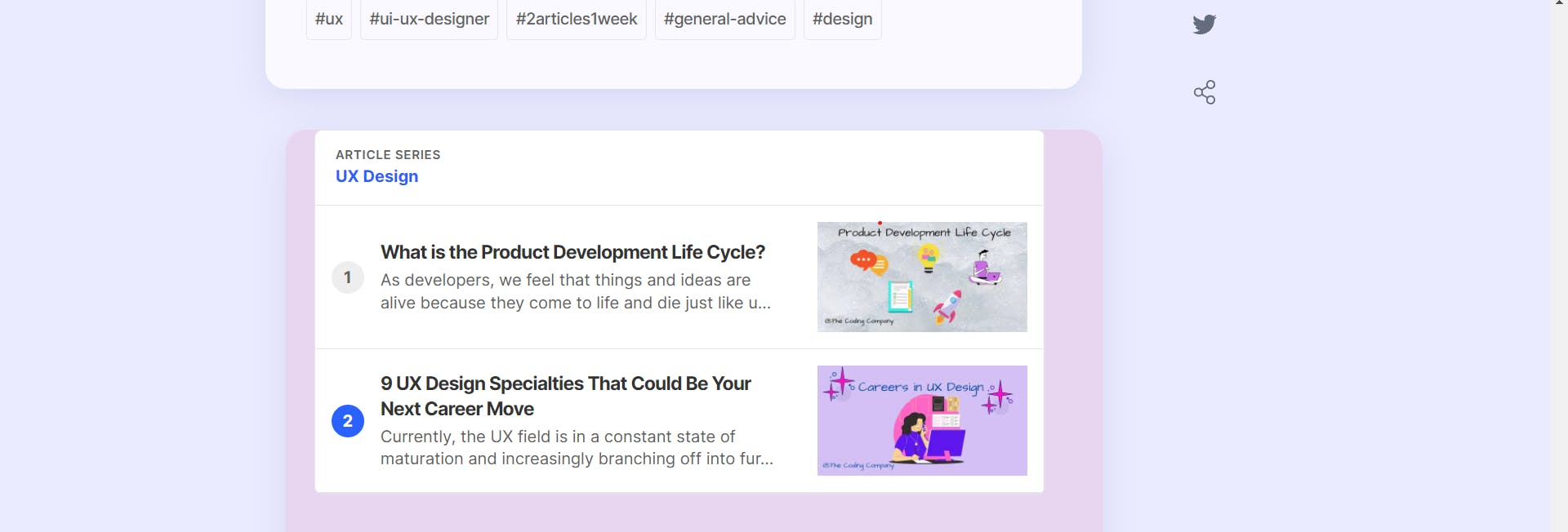
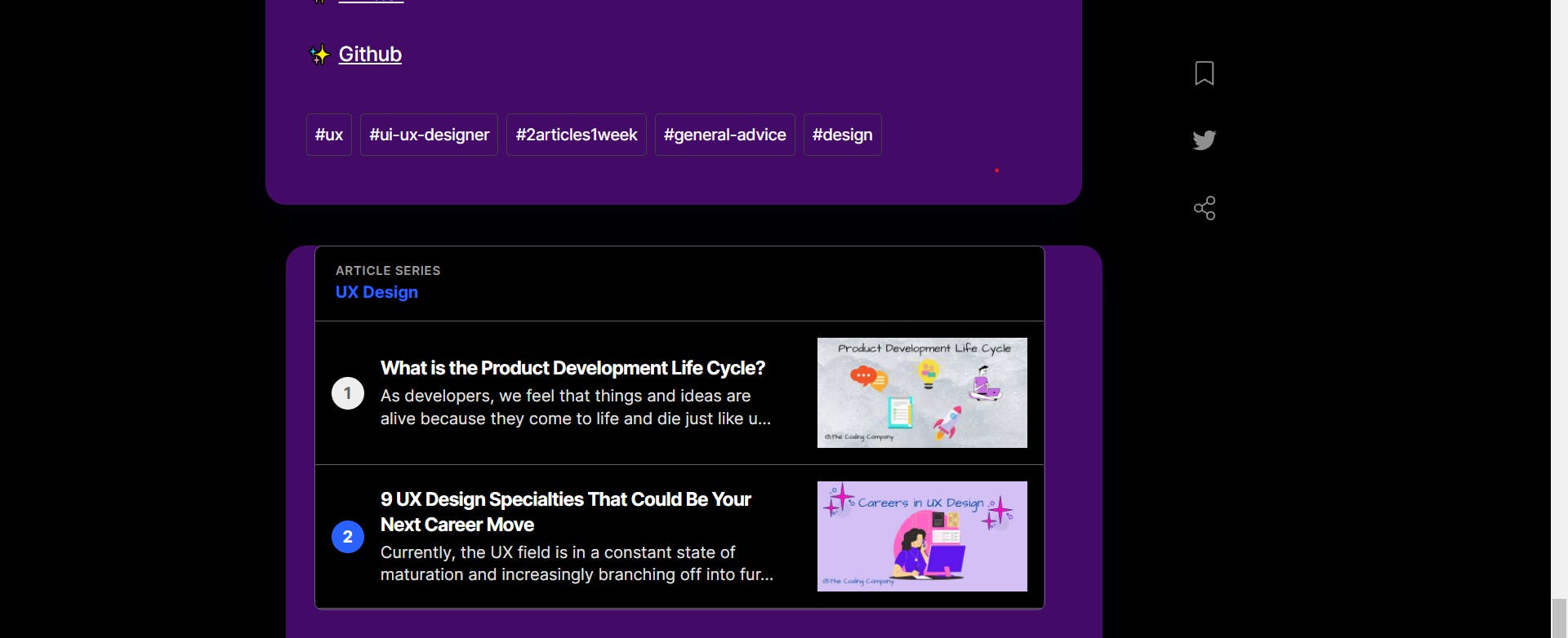
Series List and Post Detail Card
For the series list and post detail card, I just tweaked the colors a bit. But doing so made it look much better!
See for yourself:
Light Mode:
Dark Mode:
.blog-series-list{
    background:#ffffff;
}

.dark .blog-series-list{
    background:#000000;
}

.blog-series-heading{
    background:#ffffff;

}

.dark .blog-series-heading{
    background:#000000;

}

.blog-post-detail-card{
    background: #eaebff;
}

.dark .blog-post-detail-card{
    background: #000000;
}
.dark .blog-comments-section-wrapper{
    background: #440A67 ;
}
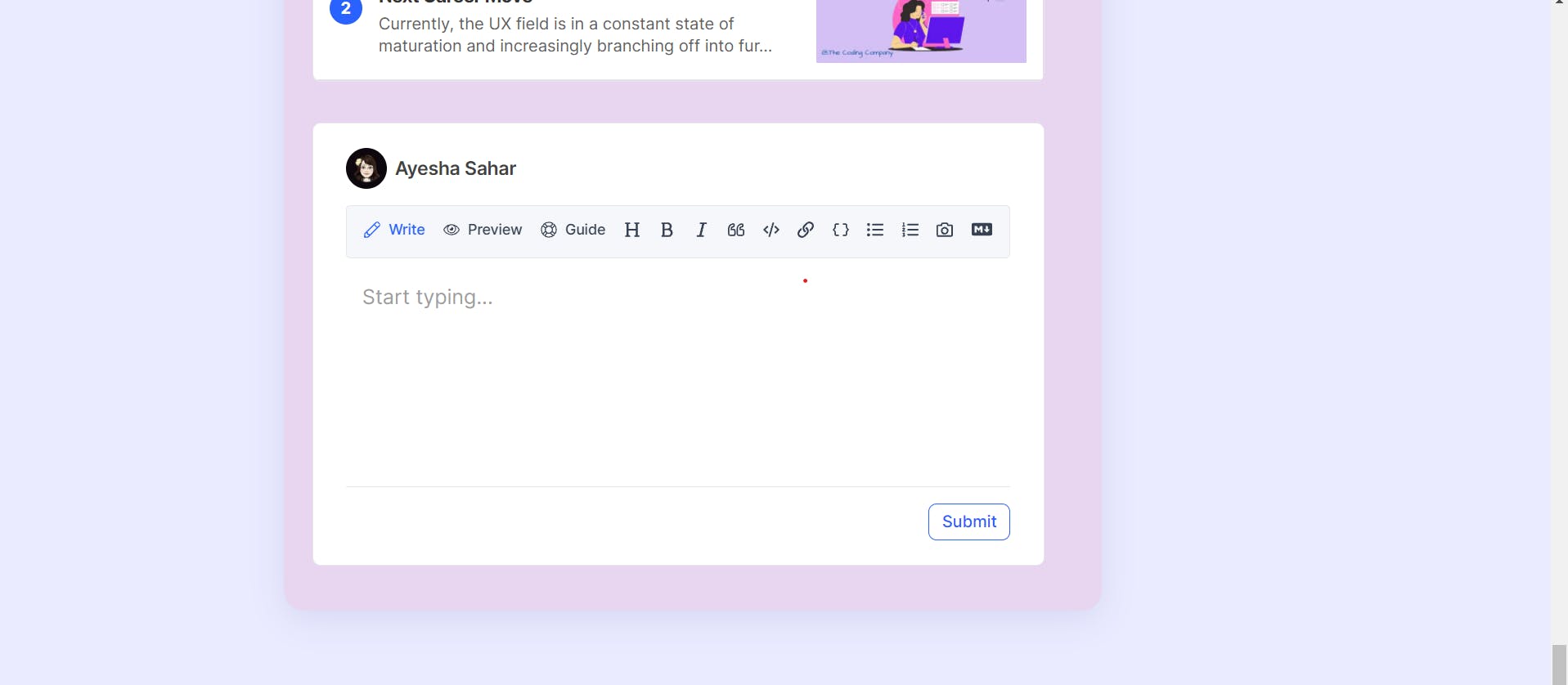
Comment Section
Before, the comment section didn't really have a defined boundary and didn't look anything special. But by the magic of CSS, it looks lovely!
Light Mode:
Dark Mode:
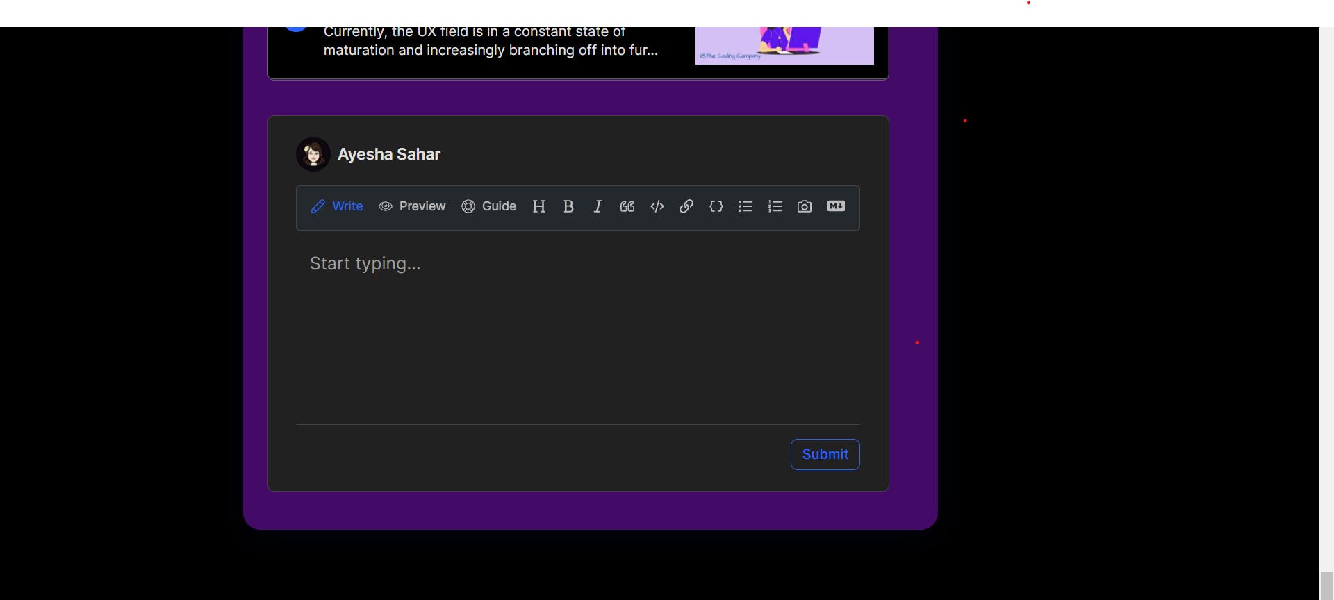
This is how I styled the comment section:
.blog-comments-section-wrapper {
   background:#e8d5f0;
   box-shadow: 0 8px 32px 0 rgba( 31, 38, 135, 0.1 );
   padding: 20px;
   border-radius: 20px;
}

.dark .blog-comments-section-wrapper{
    background: #440A67 ;
}
Main Article Area
Just like the comment section, the boundaries of the main article area were not defined and everything was just plain old white. White looks good but doesn't look good, if you know what I mean🤷♂️ So I revamped the main article area too! I won't add a picture here because you are currently experiencing the magic of CSS ;)
This is how I designed it:
.blog-content-main.article-width {
  background: rgba( 255, 255, 255, 0.7 );
  box-shadow: 0 8px 32px 0 rgba( 31, 38, 135, 0.1 );
  border-radius: 20px;
  padding: 40px;
  margin-top: 40px;
  margin-right: 40px;

}

.dark .blog-content-main.article-width {
    background: #440A67;
}
I changed some colors and added the good old paddings along with a slight box-shadow. All in all, it looked quite appealing to me.
Conclusion
To all those blog owners who did not know how to style their Hashnode blog: This wasn't much but I hope it is clear now how easy it is to customize your blog. Now go and tweak some colors and add some good old paddings. Your blogs are definitely gonna look much more handsome/beautiful ;)
Let's connect!
✨ Github